


Listen to this article
Estimated 3 minutes
The audio version of this article is generated by text-to-speech, a technology based on artificial intelligence.
A Saskatchewan artist is celebrating the Saskatchewan Roughriders' Grey Cup victory with a new tribute logo.
The Riders defeated the Montreal Alouettes 25-17 in a dramatic finish Sunday night, securing Saskatchewan’s first Grey Cup title since 2013.
To mark the victory, Chris Chipak, an artist and illustrator from Red Pheasant Cree Nation, south of North Battleford, created a design using elements from an earlier Indigenous logo he made for the Riders, which has become one of the team’s most popular designs.
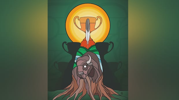
The new artwork features the Grey Cup, of course, with silhouettes of the team's four other trophies in the shadows.
 Chris Chipak's Grey Cup design honouring the Saskatchewan Roughrider's fifth CFL championship win. (Chris Chipak)
A single feather rises up from the trophy’s centre, illuminated by the glowing sun in the backdrop.
Below it, a buffalo sits at the base, its mane transforming into roots that stretch out across the ground.
Chipak said the moment that inspired the design came as he watched the championship game on Sunday and noticed fans wearing his earlier work.
"It kind of hit me watching the Grey Cup, to see people in the crowd wearing the colours that I put as the logo,” he said. “The amazing part is, I get to have that every time I watch the game.”
Last season, Chipak created the Indigenous Riders logo featuring the buffalo, river, sun and the iconic "S" between two feathers, as part of the team’s Truth and Reconciliation initiative.
A full-colour version of the logo was released earlier this year, and has become popular with fans.
Chipak said the way Indigenous families embraced it stays with him.
"It’s kind of more so that’s their logo. There’s no ifs, ands or buts. If they’re getting it, they’re getting it for auntie, grandma, niece, nephew, brother, sister," he said.
"It’s such a nice rewarding feeling to know that they stand behind it and that they’re proud of it."
The new design, he said, is meant to honour the pride and emotion behind the win, and the connection the team has built with fans across the province.
 Ahead of the Grey Cup game, Chipak also created a digital illustration of running back A.J. Ouellette. (Chris Chipak)
Ahead of the final, he also created a digital illustration of Riders running back A.J. Ouellette as excitement built heading into the championship.
Chipak hopes the new design becomes a reminder of the historic win, and of how sport brings people together across Saskatchewan.