








A website without clear direction is like a museum with no signage. Visitors admire the exhibits, wander through a few rooms, and then leave without ever reaching the gift shop. Everything on display might be impressive, but without guidance, the experience leads nowhere productive. Every site needs a mechanism that tells visitors precisely what to do next, and that mechanism is the call-to-action.
CTAs come in various shapes — buttons, hyperlinks, short phrases embedded in body text. Their singular job is to convert passive readers into active participants. A visitor who reads three paragraphs and then encounters a well-crafted prompt is far more likely to engage than one who scrolls endlessly through information with no destination in sight.
This article examines why CTAs are indispensable and walks through the techniques that separate forgettable prompts from ones that genuinely drive action.
Why vague links confuse and repel visitors
Think about navigating an unfamiliar airport. Signage directs you to gates, baggage claims, lounges, and restrooms with precision. Remove those signs, and even experienced travelers become disoriented. Websites suffering from poor CTAs create a parallel experience — one defined by confusion and eventual abandonment.
The internet is saturated with generic button labels. "Submit," "Click here," "Go," "Learn more." These phrases fail for a consistent set of reasons. They provide no indication of what occurs after the click. They offer no incentive for the visitor to follow through. And they communicate a lack of thoughtfulness that undermines overall credibility.
"Learn more" deserves particular scrutiny because of its sheer prevalence. It has become a default label on thousands of websites, yet it tells the reader almost nothing. Learn more about what? A detailed guide? A single statistic? A ten-page technical brief? When people cannot predict the outcome of a click, they abandon the attempt. Any professional web design company that reviews a site's content will immediately spot these empty phrases and recommend specific, outcome-oriented alternatives.
CTAs as structural pillars of the user journey
Every thoughtfully designed website follows a logical progression. A visitor arrives, encounters the core message, evaluates supporting details, and eventually reaches a point where action becomes the natural next step. CTAs function as the bridges connecting each phase of that progression.
Remove those bridges, and the visitor must independently decode how your site is organized. Usability research consistently shows that people will not invest that effort. They will scan a page, find no obvious path forward, and leave within seconds.
A strong CTA acts as a courteous usher. It acknowledges what the visitor has just consumed and points them toward the next relevant destination. "You have explored our portfolio — meet the team behind the work." This small handoff eliminates friction and makes continued engagement feel effortless rather than forced.
Connecting website traffic to real-world outcomes
Search engine optimization, social media marketing, and paid advertising all consume significant budgets. The entire purpose of driving visitors to a site is to generate measurable results. Traffic alone, however, is a vanity metric unless those visitors eventually take a desired action.
A conversion happens when a visitor completes a task you have designed your site to encourage. Purchasing a product, submitting a contact request, registering for a webinar — each of these qualifies. The CTA serves as the precise moment where interest transitions into commitment. It is the catalyst without which the transition rarely occurs.
If a call-to-action sits hidden at the bottom of a page or blends into the surrounding color scheme, fewer people will ever encounter it. But even a perfectly visible button underperforms when its wording is vague. Visual placement captures attention; persuasive language compels the click. Both elements must work in harmony.
Writing CTAs that earn genuine engagement
Crafting an effective call-to-action demands neither marketing genius nor creative flair. It demands precision, brevacy, and empathy for the visitor's perspective. Below are the foundational principles that consistently produce results.
Open with a clear action word
A CTA is an instruction, and every instruction needs a verb to anchor it. Replace "Product Information" with "Browse Product Specs." Swap "Resources" for "Explore Available Resources." The verb eliminates ambiguity about the step the visitor is about to take.
Stick with common, widely recognized verbs. Get, try, start, discover, reserve, build. There is no advantage to reaching for unusual vocabulary when crafting button text. Straightforward language converts at higher rates than inventive alternatives, and this holds true across virtually every industry.
Make the benefit unmistakable
People do not click buttons for the sake of clicking buttons. They click because they anticipate something valuable on the other side. Your CTA language should reflect that anticipation clearly.
"Claim your complimentary consultation" outperforms "Submit request" by a wide margin because it foregrounds the visitor's advantage. "Download the startup checklist" surpasses "Click to continue" because it specifies exactly what the visitor receives. Frame every CTA around the person's payoff rather than your internal label for the process.
Keep the wording tight
Buttons offer limited real estate, and an effective CTA never exceeds five words. Beyond that point, the label starts reading like a sentence and renders poorly on mobile screens. "Build your custom plan" takes four words and communicates instantly. "Add to wishlist" takes three and crosses every language barrier. Remove any word that does not actively earn its place.
Imply timeliness through relevance
Motivating prompt action is a worthy goal, but aggressive countdown language tends to erode trust rather than build it. A more sophisticated approach uses gentle relevance to encourage movement.
Instead of "Order now before time runs out," consider "Register for this Thursday's workshop" or "Download this quarter's free template." Both suggest that the present moment carries additional value. The implied window feels informative rather than manipulative, preserving the visitor's confidence while still nudging them forward.
Match the CTA to the visitor's readiness
A person who discovered your site thirty seconds ago is not prepared for a heavy commitment. A "Buy Now" button at the top of a homepage often feels jarring to someone still orienting themselves. At that early stage, a lighter prompt like "Watch a quick overview" is far more appropriate.
Hold the strongest conversion-focused CTAs for pages where trust has been established. Once a visitor has absorbed your narrative, reviewed evidence of your expertise, and considered your offerings, a prompt like "Schedule a discovery call" or "Start your project" aligns naturally with their state of mind.
Design amplifies the impact of every CTA
An experienced website designer will confirm that even the strongest button copy falters when the visual presentation is neglected. The two elements are inseparable partners in driving results.
Contrast is the most critical visual factor. A button rendered in a color distinct from the page background immediately draws the eye without requiring any effort from the visitor. Size the element generously enough for comfortable interaction on touchscreens. Surround it with adequate whitespace so it feels purposeful rather than cramped.
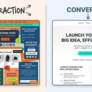
A separate but equally important concern is competition. When multiple buttons on a page share equal visual weight, the visitor faces an unwanted choice — and typically resolves it by clicking nothing at all. Establish a clear hierarchy where one primary action claims visual dominance in each section.
Errors that silently reduce conversions
A methodical review of your existing pages will likely uncover several persistent CTA issues.
The most damaging is overloading a single page with multiple simultaneous requests. You might want visitors to call, email, subscribe, and follow your social channels all at once. That overload fragments attention and paralyzes decision-making. Instead, designate one primary action per page and structure the surrounding content to support that singular objective.
Placement constitutes a second common failure point. Burying the CTA deep below extensive body text means many visitors will never scroll far enough to see it. Introduce action opportunities near the top and provide additional prompts at logical content breaks throughout.
A third recurring mistake is the use of abstract corporate language. Expressions like "Synergize your operational framework" or "Harness paradigm-shifting innovation" carry no meaning for a visitor scanning quickly in search of clear direction. Conversational, plain phrasing always outperforms internally focused jargon.
Testing as the foundation of improvement
No one produces a flawless CTA on the first attempt. The encouraging reality is that calls-to-action are among the most straightforward page elements to test, measure, and refine.
A basic A/B experiment delivers useful data without requiring extensive resources. Create two versions of a single page with identical layouts, imagery, and body copy. Change only the CTA button text. Divide incoming traffic between them and measure which version generates more completed actions — "Get your project estimate" versus "See what your project costs" — over a defined period.
Even minor wording adjustments have been known to produce significant changes in conversion performance. A disciplined web design company will treat every CTA as an ongoing experiment rather than a final deliverable, returning to review and refine it on a regular schedule.
Closing perspective
A website that lacks clear, well-constructed calls-to-action represents a missed opportunity of considerable scale. Visitors need explicit, compelling instructions, or they default to doing nothing at all.
Compose CTAs built on decisive verbs, tangible benefits, and minimal word counts. Ensure those buttons command visual attention through smart contrast and generous spacing. Guide every visitor with intention from their entry point through to the action that matters most.
When questions arise about optimal placement, effective wording, or how to map a user flow from entry to conversion, professional support can provide immediate clarity. A knowledgeable website designer can audit your current pages, pinpoint exactly where engagement falters, and develop a CTA strategy that transforms static content into a dependable driver of business growth.