


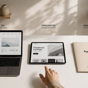


Your contact page could be the highest-converting asset on your site. It's the bridge between "just browsing" and "ready to buy." Yet most businesses treat it like a digital afterthought. They drop in a basic form, copy-paste their address, and move on.
That casual approach bleeds opportunity. Every incomplete form is a lead that slipped through your fingers. Every confusing field is another reason for a prospect to bounce. When your contact page feels like a chore, visitors will find an easier path—likely to your competitor.
Over my career as a website designer, I've dissected hundreds of contact pages across industries. The same problems surface again and again. Clunky forms, vague instructions, and broken mobile experiences destroy what should be a simple handoff. The silver lining? Most fixes are surprisingly straightforward. You don't need a six-figure rebuild to see meaningful gains.
Below is a practical roadmap for turning your contact page into a lead-capturing powerhouse.
Why the Contact Page Gets Zero Attention
Marketing teams pour energy into splashy homepages, polished product pages, and SEO-optimized blogs. The contact page? It rarely makes the meeting agenda. The thinking goes: it's just a form. How hard can it be?
The truth is, a high-performing contact page must accomplish three distinct jobs: remove obstacles, earn trust, and tell visitors exactly what comes next. Miss any one of those, and you're leaking leads you never knew you had.
Here's what makes this so frustrating: the people landing on your contact page are already warm. They've browsed, they've compared, they've decided to reach out. Your only job is to not mess it up. Every extra click, every moment of doubt, every "wait, what do I put here?" is a conversion killer.
Five Form Flaws That Drive Prospects Away
Field Overload
Each additional field is a tax on the user's patience. Do you truly need to know someone's job title, department, and annual budget before you'll answer a question? Strip it down. Name and email are non-negotiable. Everything else should fight for its place.
Lazy Labeling
"Message" tells the user nothing. "Comments" is even worse. What are you actually asking for? Replace vague placeholders with clear prompts like "What problem are you trying to solve?" or "Describe your ideal outcome." Better labels mean better responses and fewer abandoned forms.
The Black Box Problem
Visitors freeze when they can't predict what happens after they hit send. Will you email them? Call within the hour? Auto-reply with a generic "thanks"? Uncertainty breeds hesitation. A simple promise—"We reply to every inquiry within 4 hours"—can be the difference between a submission and a bounce.
Mobile Neglect
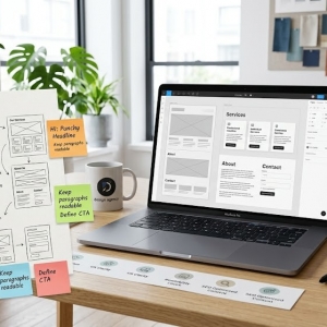
Desktop forms often fall apart on smartphones. Input fields shrink to unusable sizes. Dropdown menus refuse to cooperate. The keyboard covers half the screen. Test your form on the devices your audience actually uses. If you wouldn't fill it out on your phone during a commute, neither will they. This is exactly why smart brands hire a website designer to audit mobile UX before launch—small oversights here cost big in lost conversions.
Forcing the Form
Not everyone wants to type into a web form. Some people want to hear a human voice. Others prefer firing off a quick email. If your contact page only offers one path, you're alienating entire segments of your audience. Make alternatives visible and accessible.
Conversion-Boosting Tactics You Can Implement Today
Slash the Fields
If you can't justify a field's existence, delete it. You can collect company size and project timeline during your first conversation. A lean form feels approachable. An obese form feels like homework. The math isn't complicated.
Pre-Fill When Possible
Modern tools let you auto-populate fields based on known data. Location from IP. Service interest from referral source. Even guessing a name from a logged-in account reduces friction. These micro-conveniences signal that you respect the user's time.
Write Helpful Microcopy
A line of text beneath a field can work wonders. "We only use your phone number for appointment confirmations." "Your project details help us prepare a tailored response." These aren't just niceties—they're trust builders that nudge hesitant visitors forward.
Upgrade Your Button
"Submit" is the verbal equivalent of elevator music. Replace it with language that reflects the visitor's goal: "Get My Custom Quote," "Book My Free Consultation," "Send My Request." Then make it visually impossible to miss with bold color and breathing room.
Borrow Social Credibility
A testimonial snippet, a client logo strip, or a simple "Trusted by 200+ businesses" near the form lowers psychological barriers. People follow people. If others have taken this step and been glad they did, new visitors feel safer doing the same.
Design Choices That Frame the Form for Success
The form doesn't exist in a vacuum. The space around it either supports or sabotages its purpose.
Lead With Value
"Contact Us" is a label, not a headline. Try "Let's Talk About Your Goals" or "Get a Response in Under 2 Hours." The headline should remind visitors why they came and what they'll gain.
Direct the Eye
Use size, color, and spacing to create a visual path that ends at your form. Don't sandwich it between unrelated content blocks or bury it under a wall of FAQs. It should feel like the natural, obvious destination.
Add a Trust Anchor
A short privacy statement near the button—"We never share your info" or "No sales calls unless you request them"—neutralizes last-second anxiety. These aren't legal disclaimers; they're conversion insurance.
Offer Escape Routes
Some visitors will scan your form and think, "Nope, too much." Give them an out. A visible phone number. A direct email link. A "Schedule a Call" calendar widget. Choice increases comfort, and comfort increases action.
Knowing When to Call in the Pros
DIY improvements go a long way. But some challenges need a specialist's eye.
If traffic is healthy but form completions are anemic, a website designer can run a diagnostic. They'll map the user journey, identify where prospects stall, and recommend surgical fixes rather than guesswork.
If your needs go beyond the basics—multi-step conditional logic, secure file uploads, or direct CRM piping—a web design company can architect a solution that fits your stack and scales with your growth.
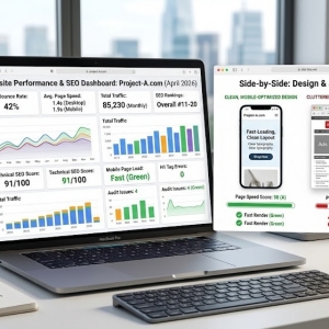
And if you're flying blind on what to test, professionals can set up structured experiments. Different headlines. Field order variations. Button color showdowns. Let data, not hunches, guide your next move.
The Iteration Imperative
Set-it-and-forget-it is a losing strategy. Install event tracking. Watch where users start the form and where they quit. Those drop-off points are goldmines of insight.
Run controlled tests. Pit a 3-field form against a 5-field version. Try "Get Started" versus "Request Info." Swap out headlines. Each test teaches you something, and small percentage lifts compound into real revenue over time.
Finally, ask the people who actually converted. A one-question post-submit survey—"What almost stopped you?"—can reveal friction you never imagined. Your users are your best consultants, and their feedback is free.
Wrapping Up
Your contact page is more than a utility. It's the handshake that starts a business relationship. Every pixel, every word, every field should serve one purpose: making that handshake as effortless and reassuring as possible.
Strip away complexity. Add clarity. Test relentlessly. Optimize for the thumb, not just the mouse.
A polished contact page won't save a bad product, but it will ensure that good products don't lose interested buyers to fixable friction. That's a high-leverage investment by any standard.
Whether you handle the tweaks internally or bring in a web design company, the guiding principle is simple: design for the human on the other side of the screen. Make it fast. Make it obvious. Make it feel safe. The leads will come.